Reception Areas, Because First Impressions Count
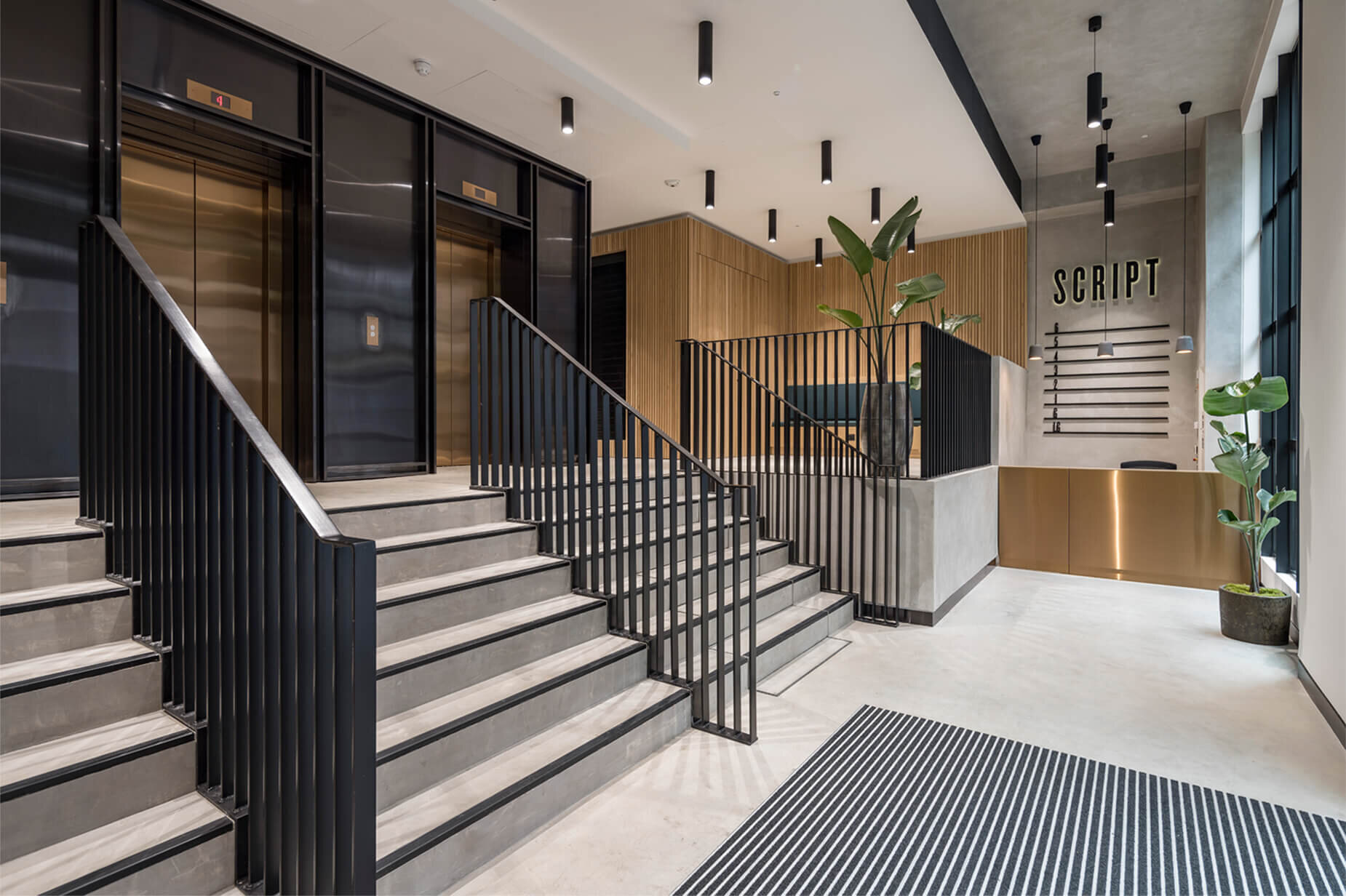
Reception areas have evolved from an access control and security (offering a functional desk and maybe a place where visitors could be seated) to multifunctional social hubs. This new approach to reception space offers a great opportunity for branding.
Blurred boundaries between the function.
In the past, reception areas were created to impress the visitors. With the arrival of a reception desk, the function of reception area shifted to more of a service point. Visitors were checked and let in, parcels have been signed for, trades people allowed access to the building. But with the arrival of technology and the boundaries between work and private life more blurred, the reception space is becoming a social hub.
New users.
Traditionally, the reception areas were used for external visitors. This thinking has recently shifted and building are extending the use their reception areas to the employees and public. In a bid of attracting the best talent possible, the reception areas are offering additional services, like a hospitality, delivery storage for amazon parcels, shared meeting rooms, cafes, concierge service all the way to event spaces and bicycle ramps.
Many people would view the office as their second home, and the quality of office accommodation and amenities are a huge deciding factor for employees.
Amplified Branding.
In the modern large scale CAT A development schemes, reception areas used to be designed in a generic style, that would suit most of tenants. They are now becoming a destination place. Designed by architectural practice responsible for the entire development project, it is one of the most important spaces that would attract the future tenants. Design teams search through historical files and any connections a building would have with a local area. It is within this exciting phase, when the development name is being decided and any design directions taken.
We have been fortunate to work on some great projects over the years and some of them had very impressive reception spaces. So we thought we share the best designs for some inspiration.
Beautifully contemporary - 44 Featherstone Road London
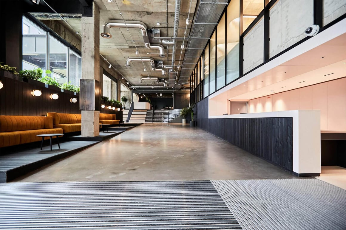
The 1960’s building lived through several reincarnations. It was first used as a metal foundry and this comes through in the design of the reception area. Entering the building from Featherstone street, the occupiers are greeted by a warm concrete structure, contemporary metal works and softer finishes like the rose gold reception desk. As the space is flooded in daylight, the designers didn’t have to go heavy on artificial lighting. We like the combination of contemporary tubular luminaire Bellart Suspended and Bellart Surface mounted, enhancing the metal staircase, window frames and lift.
The remodelled ground floor reception offers a warm and welcoming reception area with a great street-level presence.
Award Winning - The Forge, Woking.
Our largest project to date, the amazing Forge in Woking is the 2022 BCO Award winner (South of England and South Wales Refurbished/recycled Workplace).
The ground floor features a spacious and welcoming atrium that also doubles up as a breakout and social space for the occupiers. The Grid, as the atrium has been named, follows a playful geometric pattern further enhanced by architectural lighting. Lit by 10 bespoke rectangular-shaped linear lighting systems based on the Rio Suspended direct/indirect, the lighting has been used to enhance the feature effect in the atrium area.
The one with unique sun design - National Mathematics and Science College Warwick
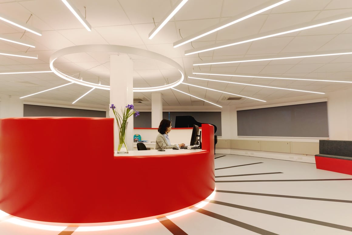
When the architect approached the team with the unique sun design back in 2015, we were understandably excited. Mirroring the design on the floor, the unique lighting features is build out of 75m linear profiles and and a 2m diameter halo fitting the Ouse. The individual rays of light range from 0.9 m to 6m. Fitted with Dali dimming, the lighting system allows a flexible use of the space. The National Mathematics and Science collage wanted to create an inspiring environment for the students, whilst portraying their interest in technology and science.
The Perfectly Symmetrical One - Beacon Tower, Bristol.
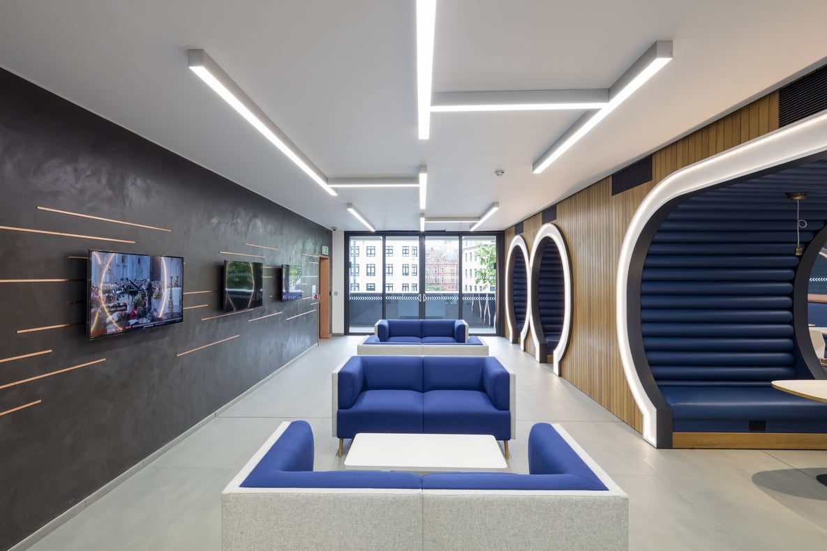
Built in 1970s, the iconic landmark in Bristol’s city centre received a revamp in 2015. Lighting played an important part of the reception area design. The interior of the reception area is beautifully symmetrical and using lines to create a grid structure. Using standard size linear profiles, the architect created a timelessly simple yet visually powerful feature.
The Intricately Designed - 49-51 Farringdon Road, London.
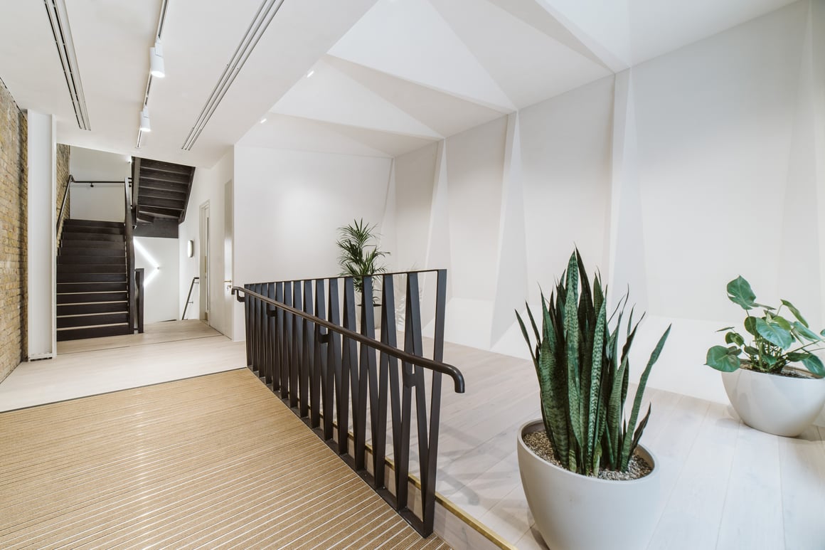
Built in 1800, Farringdon road was a home to merchants. This particular part of the street was occupied by the growing trade of street lighters. The entrance lobby is a minimalist calm space with a sculptural wall referencing the diamond shape. The space is lit by the Wey track in white finish. The subtle track lighting blends in, allowing the feature wall to take the centre stage.
One of the most unique buildings in London- 13-20 Settles Street, London.
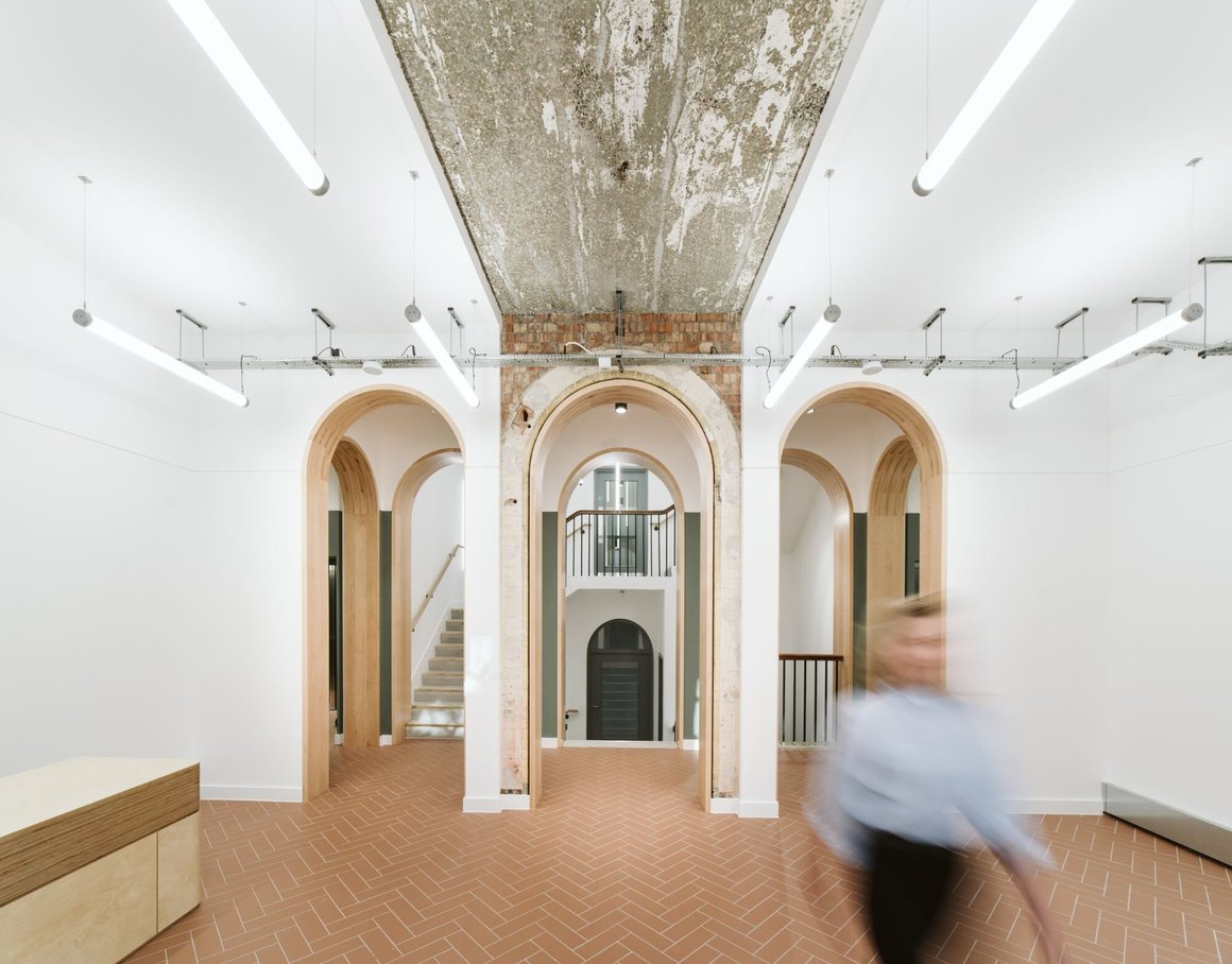
Originally built in 1930’s as a Victorian Labour Exchange, 19-23 Settles Street is a 2 storey Neo classical building. With a curved-arch ground floor plan that wraps around the front of the building, it is one of the most unique buildings in London. The ground floor level features the main entrance with a centrally positioned reception desk and break out space. Four rows of Nile Suspended have been installed horizontally, adding a trendy visual interest to the space. The two archways are exit routes to the staircase, with the middle archway giving a first glimpse of the exciting feature pendant also using Nile Suspended.
The Understated One - One Redcliff Street, Bristol.
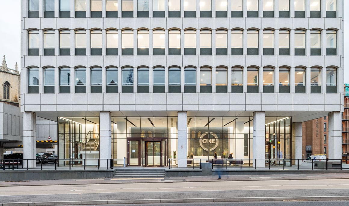
The new double-height reception area at one of the Bristol’s landmark buildings One Redcliff is beautifully clean and contemporary. The beautifully simple lighting has been achieved by recessed downlights, concealed linear lighting and uplights. This scheme definitely proves, that less is more. It is particularly nice in the evenings when you get the full effect of this lighting scheme.
 London Hustle and Bustle - Canterbury Court, London.
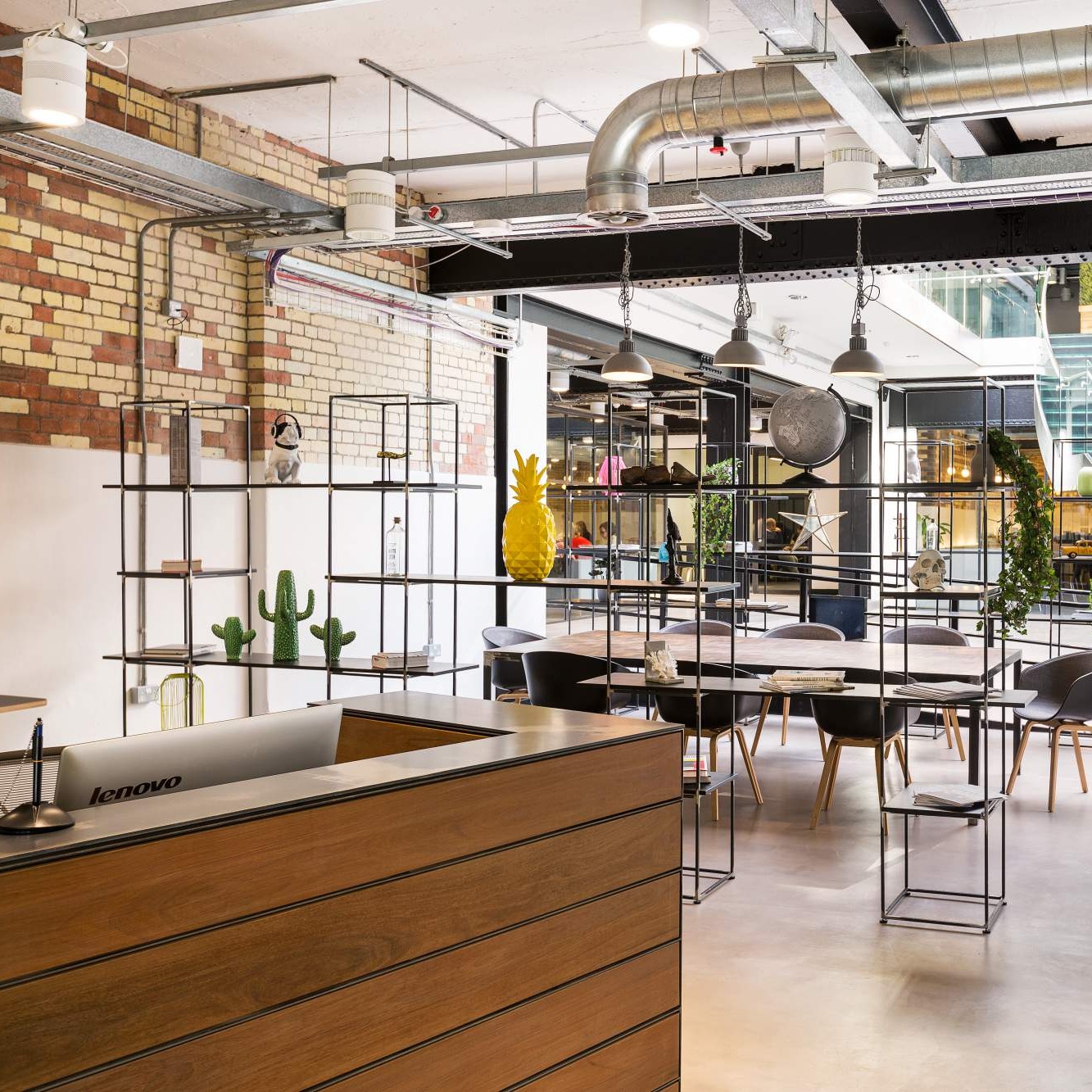
The vibrant and colourful reception of the Canterbury Court ( Kennington Park) for Workspace is full of life. The combination of the exposed ceilings, services and industrial style lighting is a perfect reflection of the Workspace brand. Decorative style fittings were used to soften the industrial style of the fitout.
Setting the tone for the high spec fit out - Aerial Direct, Fareham.
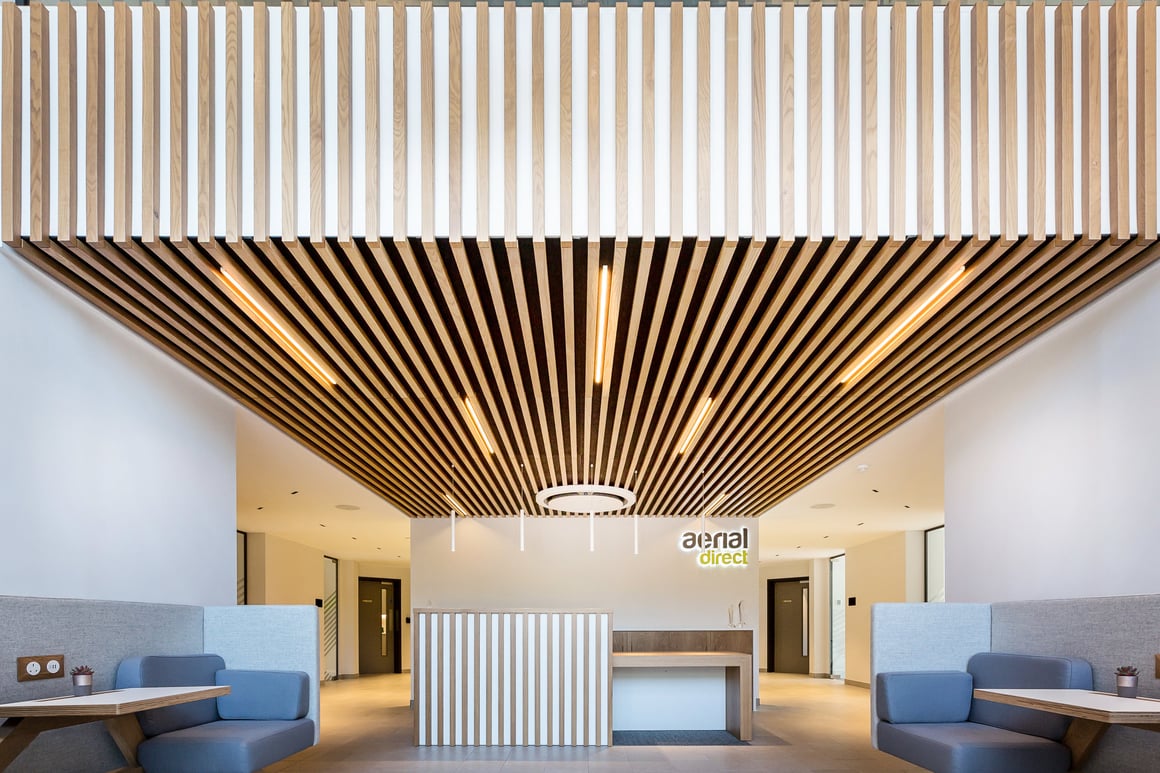
The impressive 26,000 sq ft site in Fareham is a contact centre with a state of the art demo suite, training centre and high-end facility for hosting clients. Following the design brief of creating a high-end hotel style environment, the entire space has been lit by multi-optic linear downlights, Foss. Not only is the Foss eye catching, but it also distributes a soft low glare light. The reception area at Arial Direct features linear lighting slotted in the custom joinery detail. The random pattern is playful and dynamic, mirroring the dynamic nature of client’s business. The reception desk is lit by suspended tubular fittings Bellart Mini.
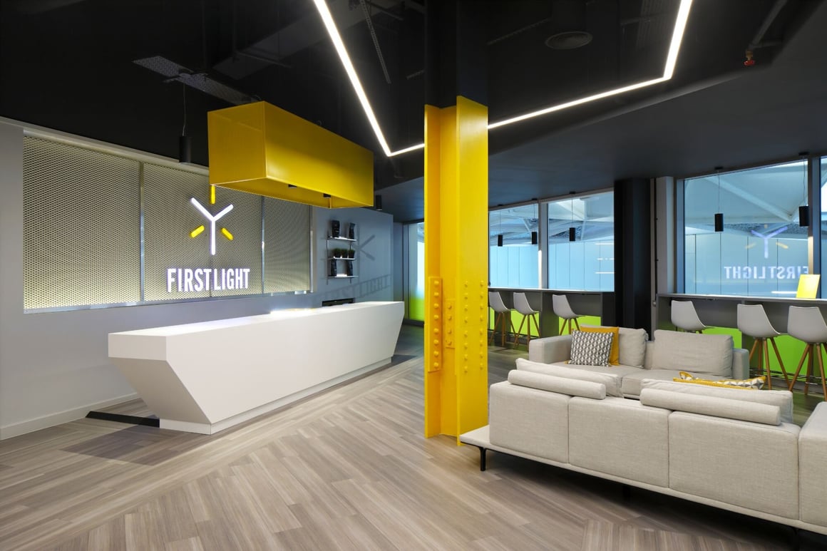
The Energetic One - First Light Cycle Studio, Westfield.
The new exercise studio FIRSTLIGHT is not ordinary studio. The 17,600 sq ft of contemporary space is designed to the very last detail and the reception area is no exception. The complex linear feature lighting runs from the entrance, up the staircase, all the way to the reception area and across the circulation space. The entire lighting system measures impressive 32.5 m and boasts several tight angles. Lighting enhances the energy of the space, inviting visitors,
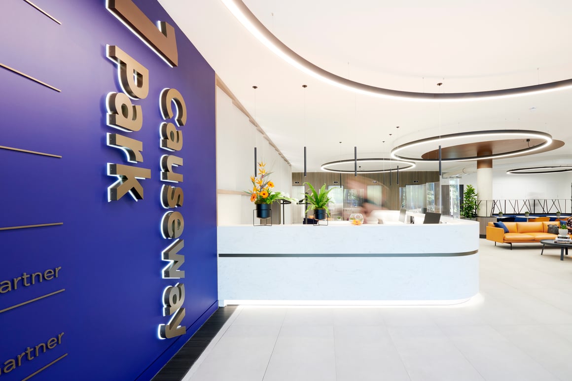
The Made to Measure WOW Effect - One Causeway Park, Staines.
The reception area of the 120,000 sq ft One Causeway Park certainly brings a wow factor. , 8 made to measure halo fittings were positioned in a random pattern. The sizes of the rings range from a 1200 mm diameter to a very impressive 5000 mm. Using a minimalist suspension kit, these giant suspended pendants appear to be floating in the space. The architectural lighting is elevating the reception area, giving the space a premium look and feel.
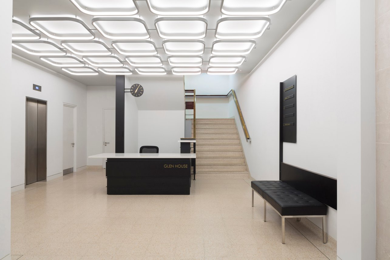
Custom fittings mirroring the concrete slab ceilings - Glen House, London
The late 1970’s building received a complete refurbishment of the entire building including a remodelled reception are. The main feature of the building are the coffered slabs ceilings. The shape of these was then replicated in the reception area through custom made architectural lighting.
The slim square shaped profiles with round edges have been designed by the architect to match the shape of the potted ceilings. The bespoke ceiling lights are side-lit using a double satin diffuser, emitting soft comfortable light.
The units are connected to another by simple conduit pipes.
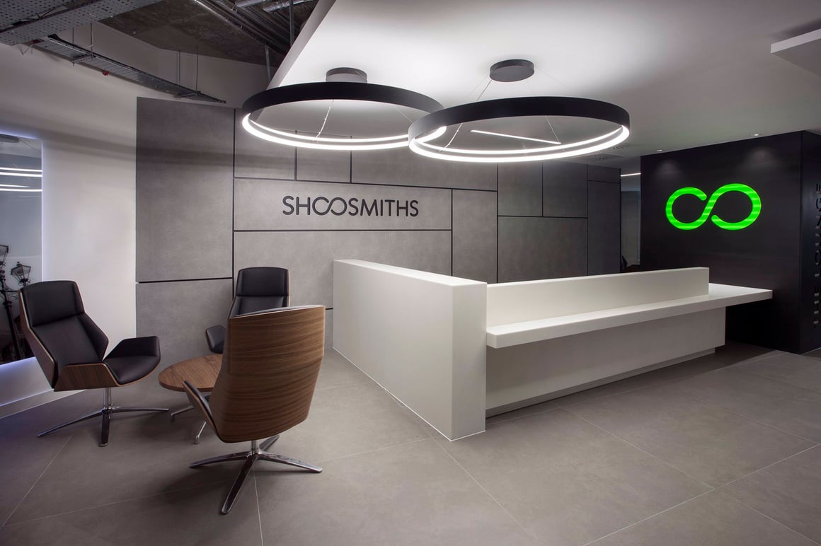
Enhanced Branding - XYZ Building, Manchester.
When the national law firm Shoosmiths moved to the XYZ Building in Manchester, the client wanted to put their own mark on their office space. During the CAT B part of the fitout, the large halo fittings Ouse were installed in the reception area. The fittings are overlapping each other slightly, creating a reference to the brand logo. It also sets high expectations for the rest of the workplace, which is lit in equally exciting way.
We hope you enjoyed our tour of reception areas and found some inspiration. Please talk to our team if you would like to put together a unique lighting scheme for your project.
Get In Touch
Whether it’s a standard fast delivery product or a custom lighting solution, 299 Lighting will guide you through the product selection and find the right product for your project.
