Using Geometric Feature Lighting in your Office Design.


Admiring curves, choosing straight lines. What makes certain shapes more popular than others?
Good design doesn’t happen by accident. Years of research has led us to understand why we are drawn to certain shapes and how we are programmed to feel a certain way when we look at an object or experience the space around us.
Recently, there has been a resurgence of geometry and abstract shapes in commercial interiors. Geometric shapes are some of the most common shapes we instantly recognize. Most of us have been acquainted with them since our nursery days. And nostalgia plays a key part in some of the things we love most. Humans find comfort in things we consider familiar like seeing an old friend or a familiar place. And geometry easily falls into the category of familiar objects. We can use geometrical shapes with their hard edges to create striking, bold designs, whilst soft shapes like circles add a more subtle appearance. But what makes us choose a certain shape for our next design concept?

Simplicity at its finest.
Often found in nature, circles are soft and smooth. A circle is also one of the strongest structural and most popular shapes. Simply because when the shape accumulates pressure it will be evenly distributed along the entire shape. It represents the cycle of life, love and commitment. A good example is a wedding ring.
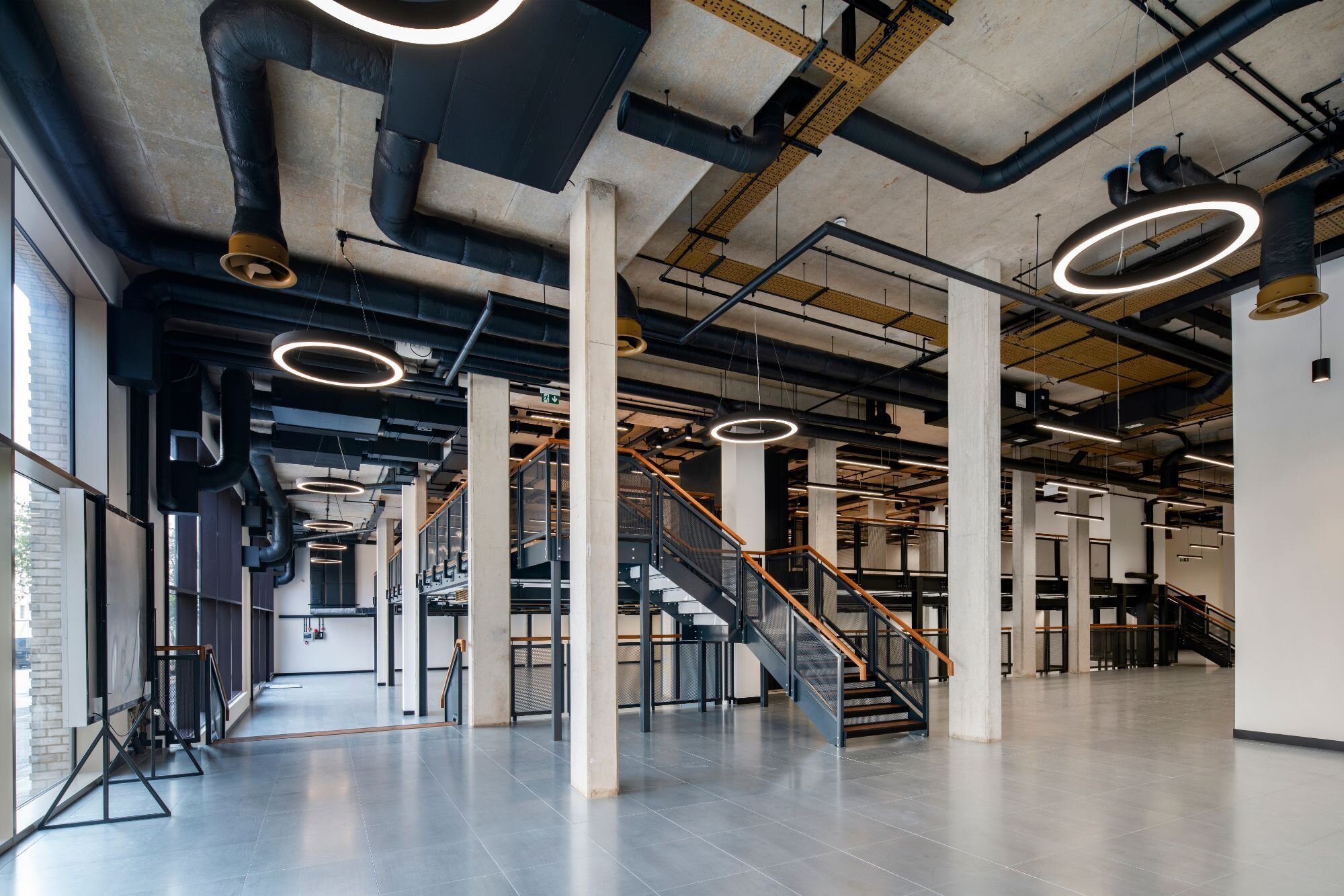
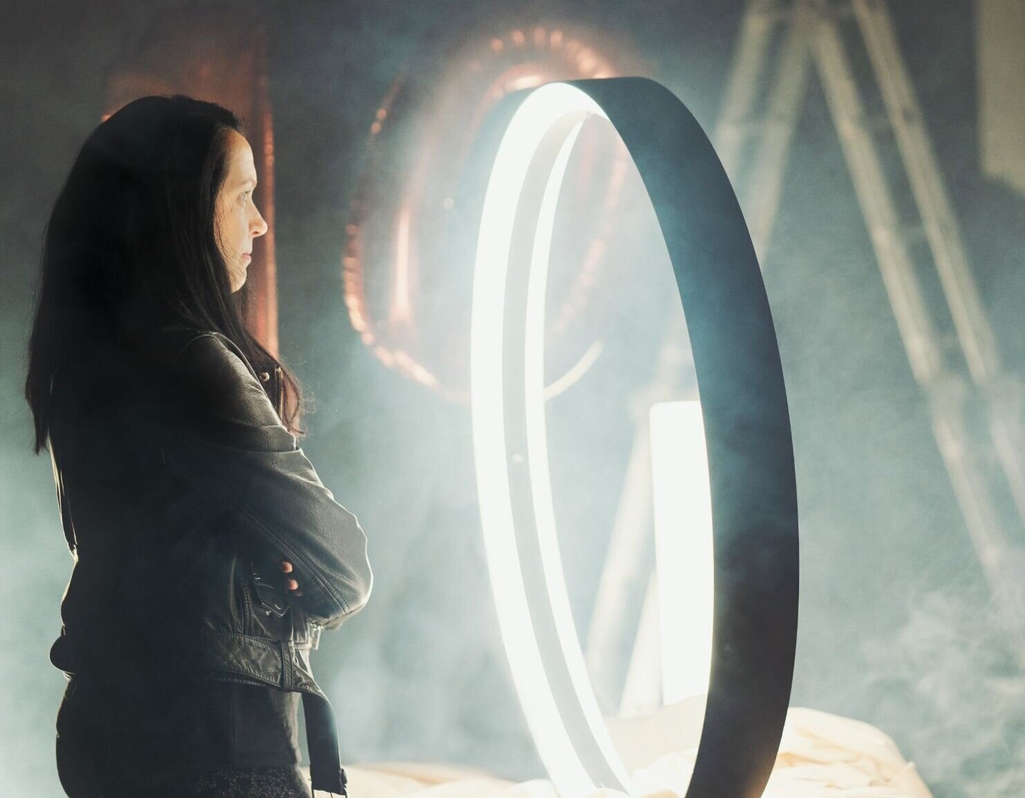
A circle or ring is a classic shape that never goes out of fashion. So it comes as no surprise that the circular or ring-shaped luminaires are one of the most popular architectural light fittings that we offer. Some years, circular shapes are more prevalent in design, then the designers fall out of love with them and start using more ‘exciting’ shapes. Then someone reinvents the circle again. Just like fashion, it comes and goes.

Shapes with feel.
Some may say that a square or rectangle may not be the most interesting of shapes, but this is where the designer can step in and unlock their potential. Stack them, layer them, put them on an angle. A new pattern is created.
Unlike the organically shaped circle, the square and rectangle are more of a man-made object. You can find them everywhere. Commonly used shapes in architecture, their hard angles can be more masculine and as such can be perceived as strong, stable and trustworthy.
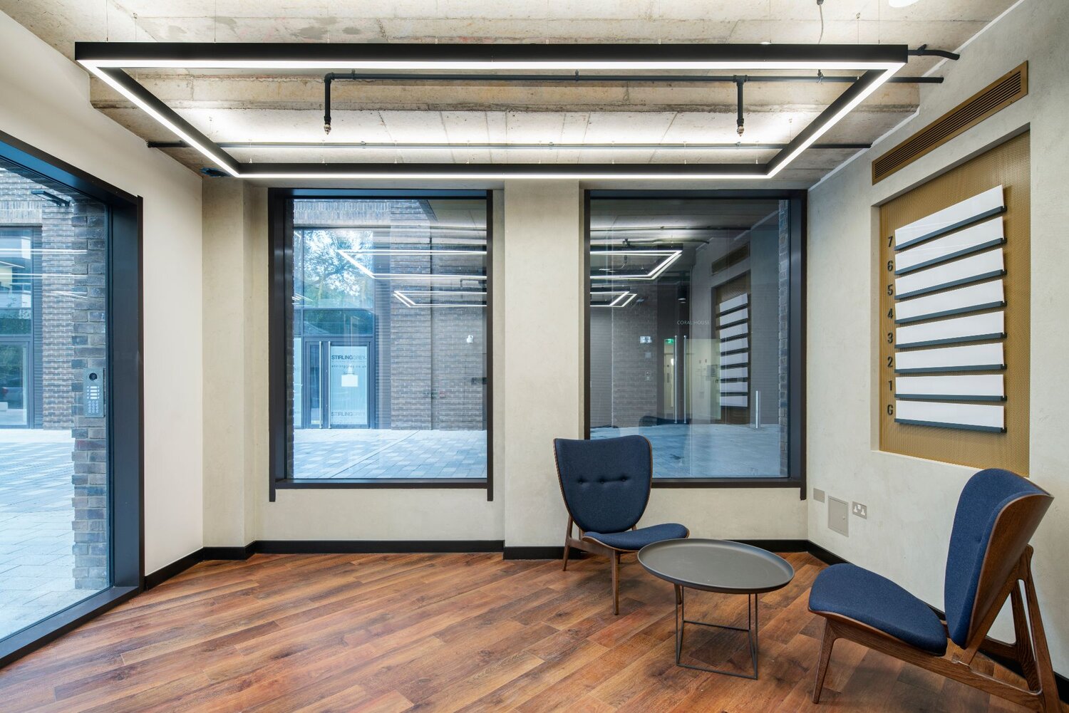
Square shapes and rectangles are widely used in commercial spaces. The popularity of linear profile and the advancement of technology is allowing us to create a made-to-measure square or rectangle fittings, so the designer can place a feature linear system into a specific area with absolute precision.
A strong look.
The basic polygon and one of the simplest geometrical shapes is perhaps the one with the widest spectrum of meaning behind it. Since the beginning of mankind, triangles have been used across so many different cultures, religions and establishments.
In a commercial environment, triangles are often used for direction and spatial orientation. The continuous advancement of technology is allowing designers to use different styles of triangles, which can be a great enhancement to branding. Triangular architectural feature lighting can bring a visually stimulative element into meeting rooms, client-facing areas or showrooms, positively enhancing the energy of the space. The new 299 Lighting office will feature triangular-shaped luminaires in the boardroom.
Make it stand out.
The perfect shape.
One of the most naturally efficient shapes is a hexagon. Due to the effectuality of their shape, hexagons are common both in nature and architecture. No wonder bees have adopted this shape for making honeycomb. A truly satisfying and structural shape especially when grouped together, each line in a hexagonal grid is as short as it can possibly be. The shape symbolizes perfection, symmetry and efficiency.
Lately, there has been an increase in the demand for hexagonal shapes in design especially with more office fit-outs taking inspiration from nature. There is not much that can beat the ‘wow’ effect of a large hexagonal-shaped feature luminaire in an entrance lobby or reception area.
Having the right impact.
The most simple geometrical shape can be used in so many creative ways. Organised in an orderly pattern representing logic and reason or scattered around in random fashion bringing playfulness and creativity to the table. In the language of lighting, a line can be suspended, surface mounted or concealed in plasterboard. Long lines, short lines. Horizontal lines, vertical curves lines. Slim lines, wide chunky lines. One’s obsession with lines can never diminish. Add corners to the lines and we are in a captivating world of architectural linear systems. The possibilities are endless and it comes as no surprise that linear lighting is the most specified and supplied type of luminaire at 299.
Curves.
Research says that when people are shown a range of products ranging from furniture, watches to containers, most people prefer curved lines to straight lines. When looking at a curved line, the part of our brain responsible for emotion is activated. Although curves are a natural form, their popularity in design comes and goes. We often admire daring curved shapes, eye-catching and tactile. And then we stop and think before we choose the straight line.
Our love affair with curves is determined by the current zeitgeist and manufacturing capabilities. In the world of commercial interiors, heavily dominated by linear design in the last decade, curved linear profiles are a new way of expressing new bold design concepts and something more designers are willing to put on a specification.
We asked our Senior Lighting Designer, how shapes can be incorporated into lighting design.
What are the most popular areas where designers tend to use the geometric range?
“Not only is the geometric feature lighting impactful, but they are also a great vehicle for brand storytelling. I have worked on designs where they have been included in boardrooms, breakout areas, receptions, atriums or gyms. They are pretty much unrivaled when it comes to making a first impression.”
Would you recommend different shapes for different project types?
“Ring-shaped fittings with their curved edges are softer on the eye so if a client is after calming ambience, a relaxed reception area, for example, I would pick our ring-shaped fitting, Ouse with its diffuse light. In contrast, we recently had a client putting hexagons into their reception area over customer seating. Whereas if you’re working with a gym, it’s a completely different environment. You would want the occupiers of the space to be motivated, to get the endorphins flowing. So an enticing ‘X’ or ‘Y’ would be more suitable for this type of space. We recently completed work on a gym in Cardiff using X-shaped luminaires.”
For everything you need to know about getting the best lighting for your office space, visit our Guide to Office Lighting.
“ When creating a design for an interior, it's important to consider the architecture of the building and any existing shapes that will be retained in the space when choosing geometric forms to include. If the design is a blank canvas, the shapes can take inspiration from the desired feel that the space should give, based on the story that it needs to tell. The scale of the shapes within the space, amount of repetition and the mix of geometric forms should be considered carefully when creating the overall look. A bolder statement can be made easily by increasing the scale, repetition and including lots of different variations.
The expression of these shapes alongside the colour choices and finishes will provide another dimension to the completed look. Styles such as Art Deco, Mid- Century and Contemporary are all iconic for using geometric design and colour to create distinctive and recognisable aesthetics that have been recreated and used as pillars of inspiration in interior design schemes.”
- Sara Barnett - Fable & Form.
