THE DESIGN BRIEF.
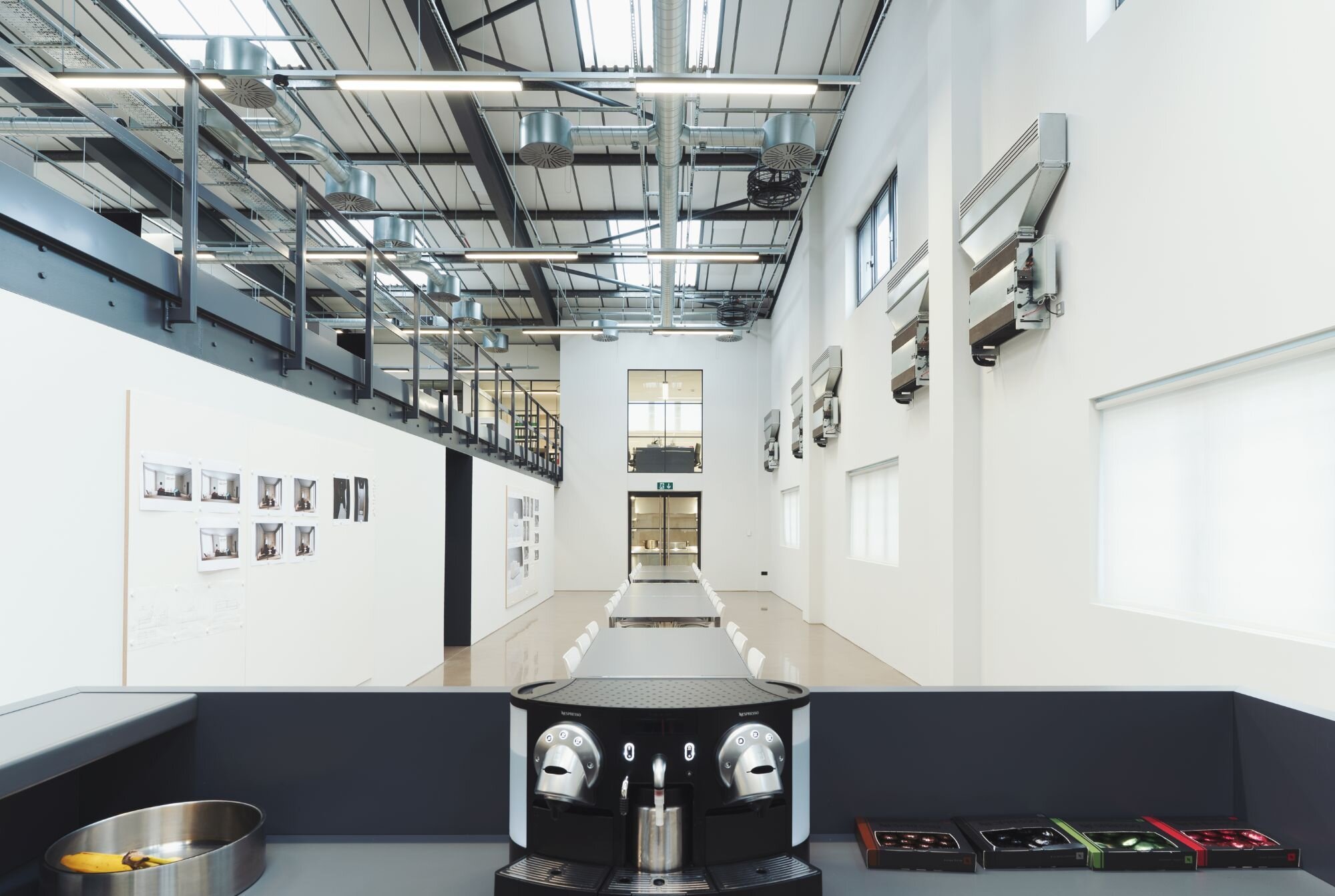
The design brief was an industrial style design inspired by the warehouse look and feel. The client requested high quality lighting delivering correct light levels and smooth dimming with the KNX control systems.
Location: West London
Sector: Office
Client: Undisclosed
Architect: Undisclosed
Value: £20K
Size: 8,500 sq. ft
Duration: 6 Months
Photography: Birdy Films
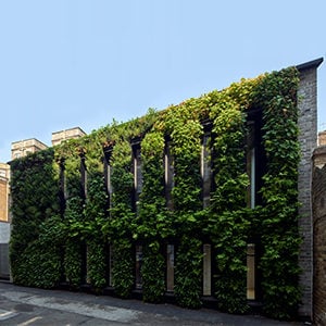
Occupying a key West London location on a premium commercial estate with a great connection to London, the property is a modern end of terrace warehouse fitted out to a high standard.
Attention to detail and engineering perfection is in the client’s DNA and their new workplace mirrors that just perfectly.
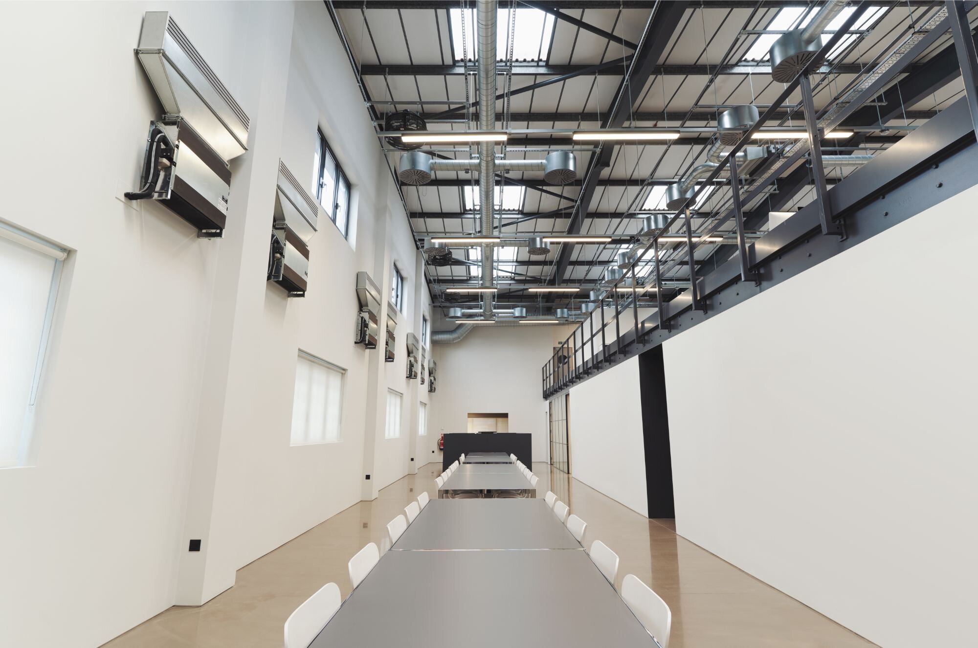
The 8,500 sq ft warehouse building consists of a ground floor with a loading bay and a mezzanine floor.
The client acquired the property as a blank canvas and designed the interior scheme, turning it into a high end office space with warehouse style look and feel.
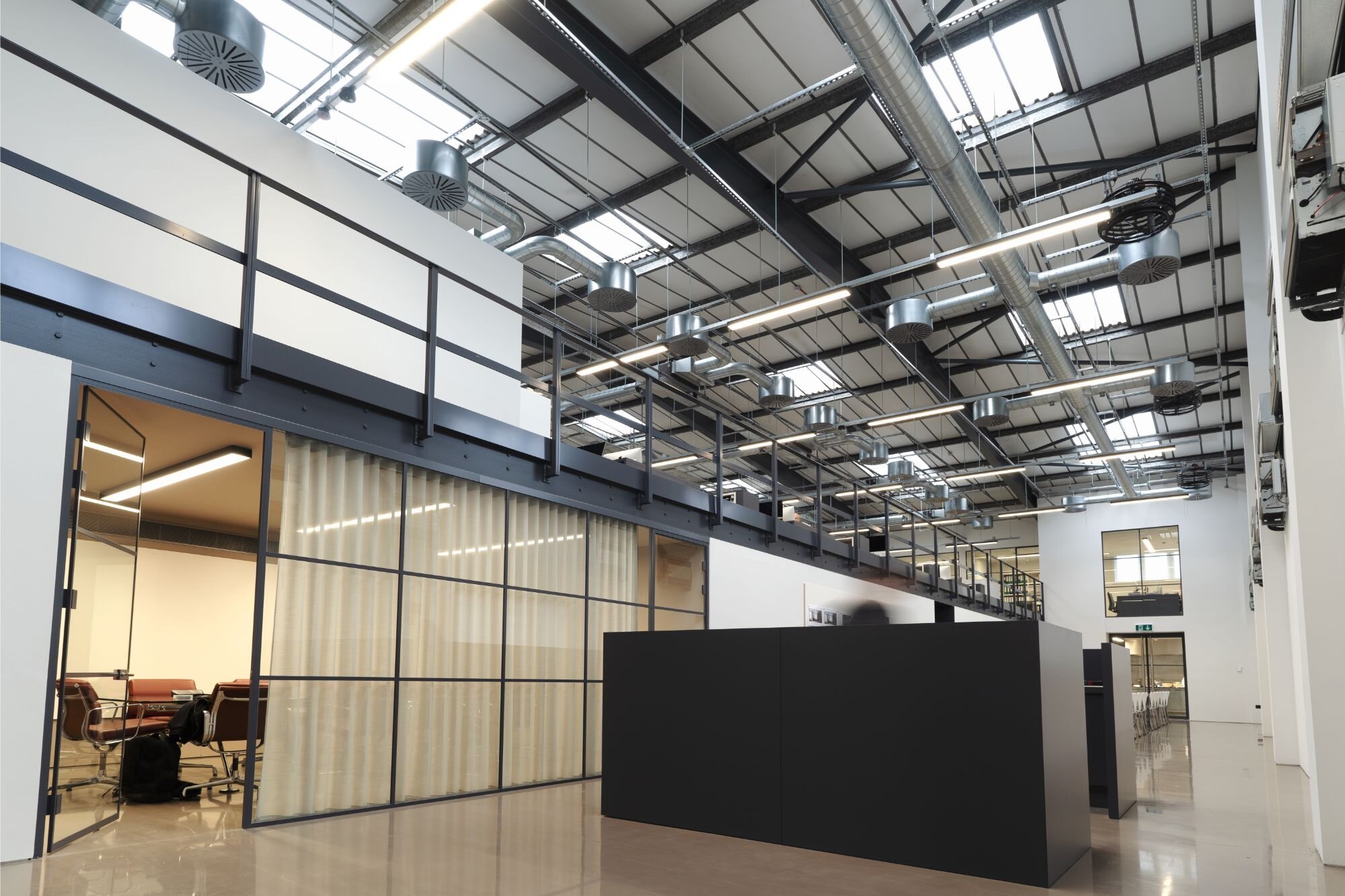
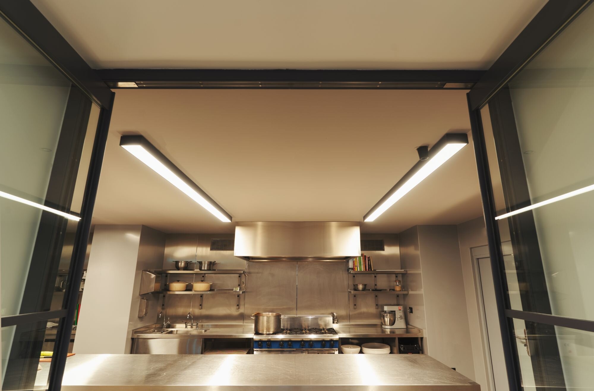
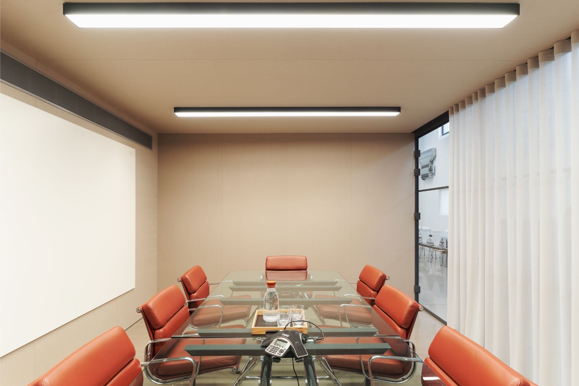
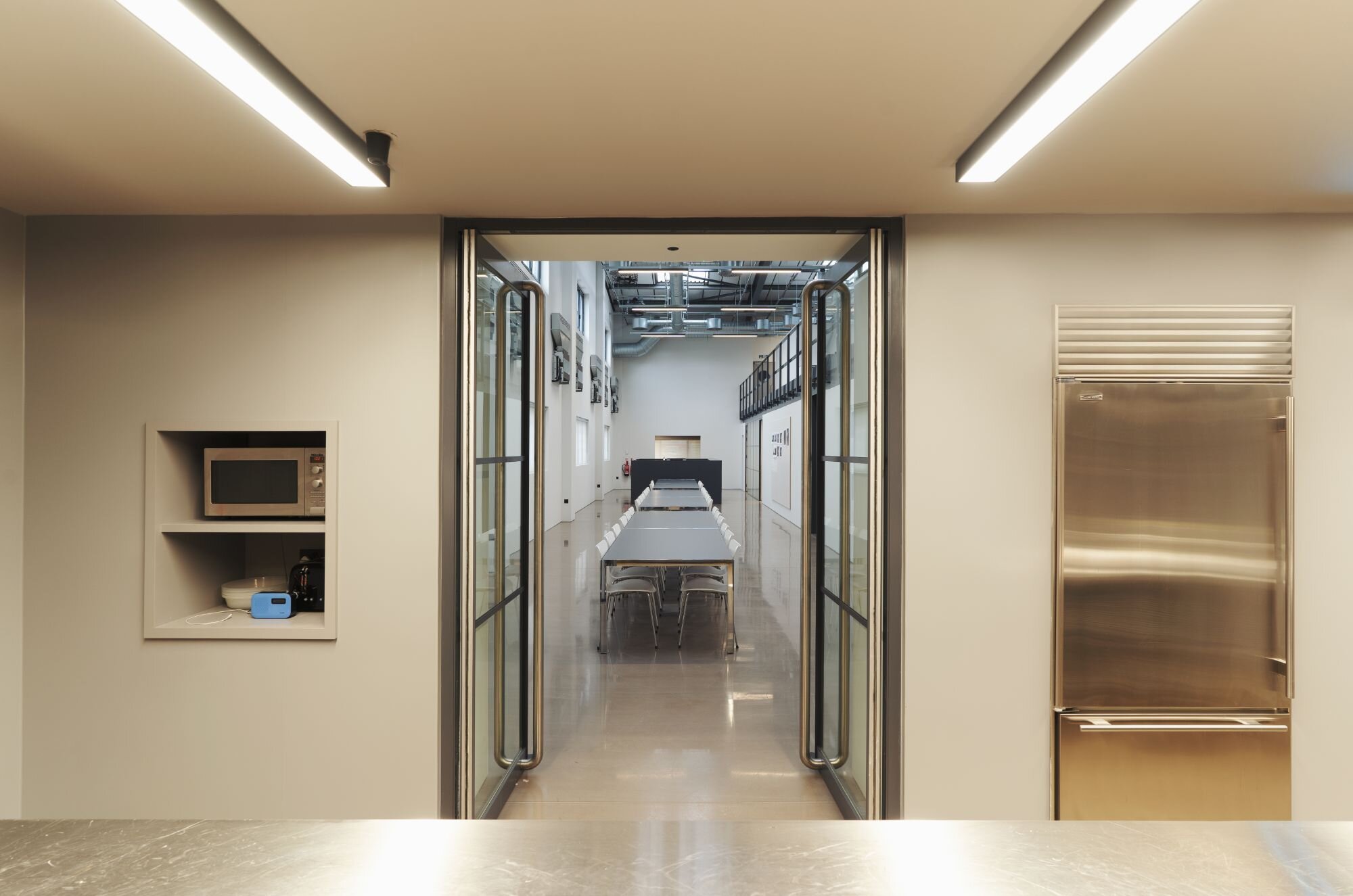
The ground floor features a reception area, meeting room, kitchen, space for assembly and a demo suite. The mezzanine floor is the main studio space with open plan office, collaborative area and 4 small meeting rooms. The whole property was remodelled and transformed into a paired down contemporary “gallery style” space.
Our technical team was approached by the client in October 2017 with the original enquiry to create a lighting scheme for their newly acquired commercial warehouse-type property.
The client operates in property development industry and was experienced in designing commercial space. They understood the importance of using quality office lighting, good quality optics, smooth dimming and controls to promote the wellbeing of their staff. Their internal design team have done their research, knowing what type of lighting they would like in their workplace.

The design brief was an industrial style design inspired by the warehouse look and feel. The client requested high quality lighting delivering correct light levels and smooth dimming with the KNX control systems.
The steel frame industrial warehouse provided a blank canvas for a contemporary colour scheme with rich shades of grey further enhanced by metal staircase and partitioning.
The office space consists primarily of open plan space with provision for tea points. The client selected several luminaires and our team attended site meetings with working samples.
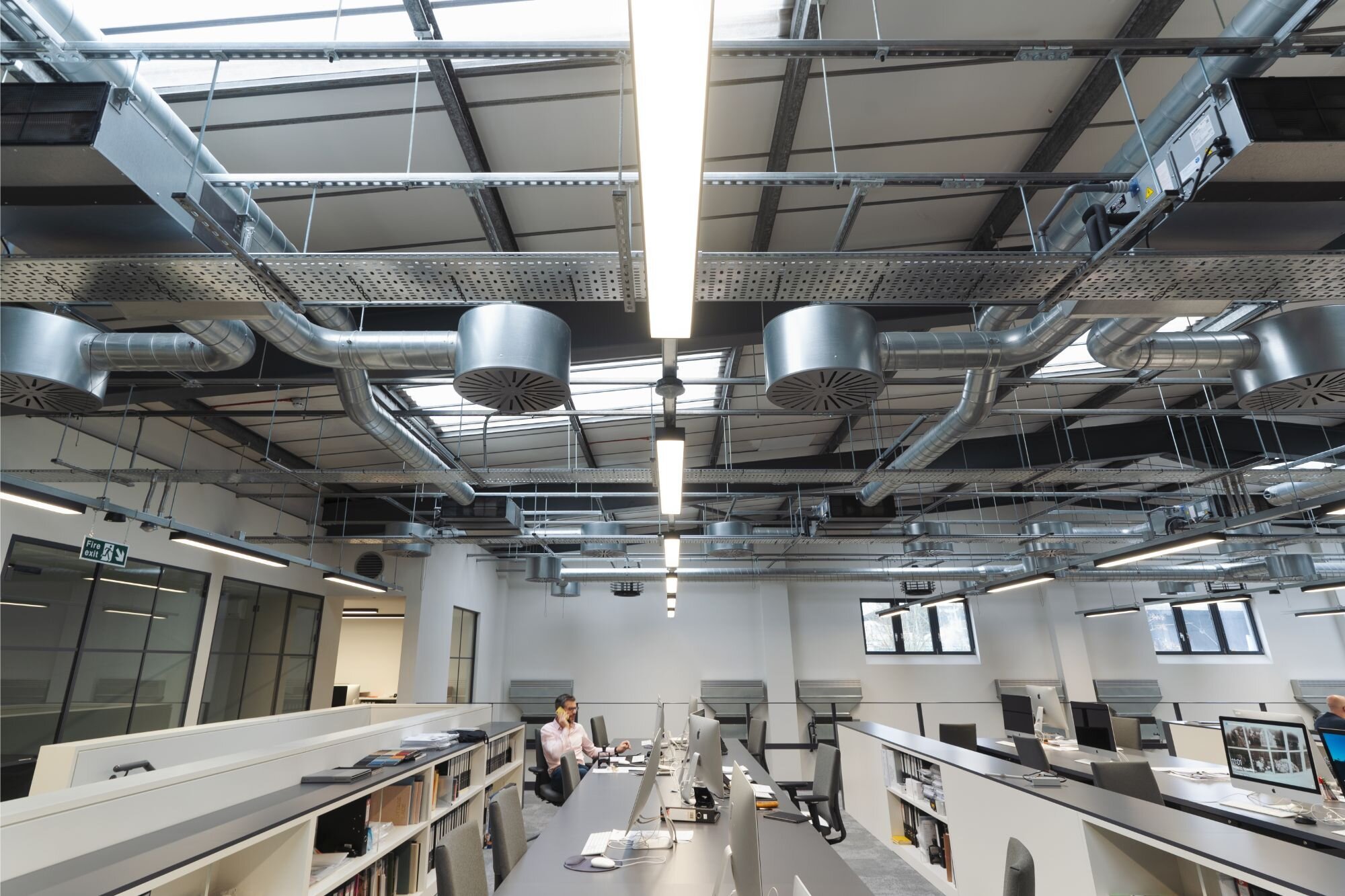
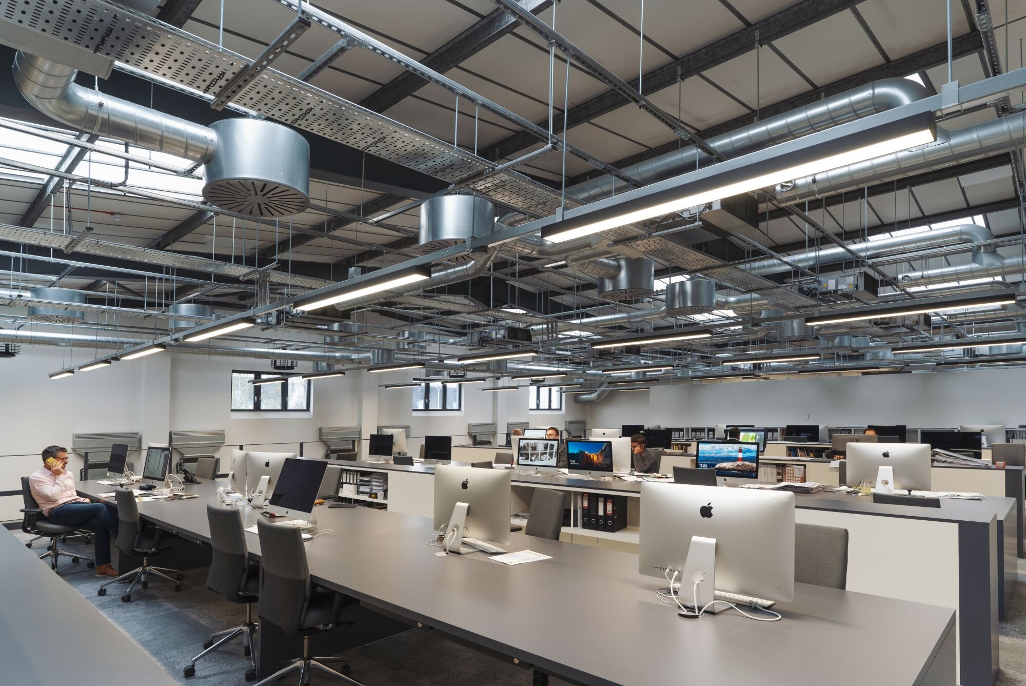
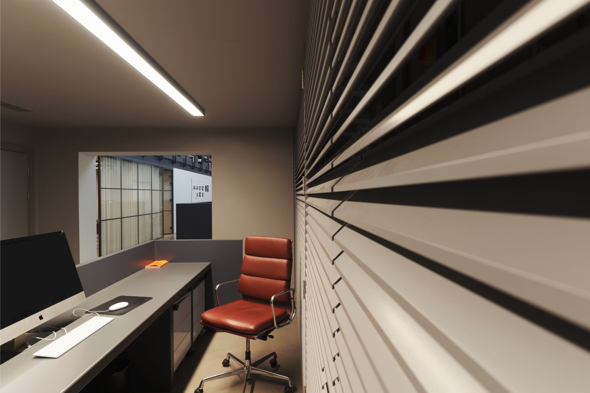
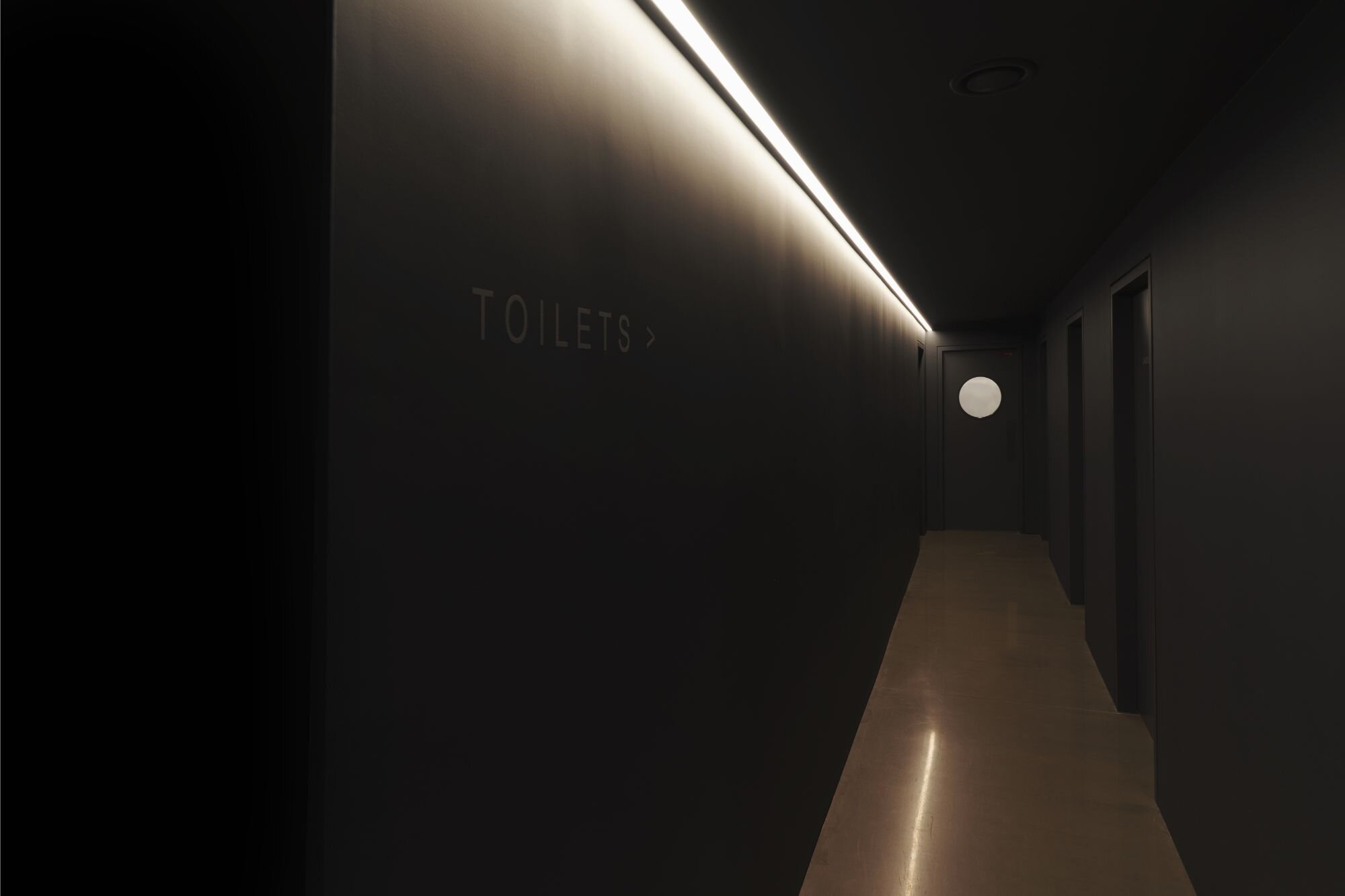
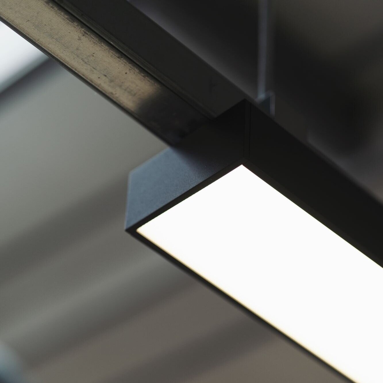
Thanks to its contemporary design and exceptionally low <16UGR, the Oka suspended and surface mounted was selected as the main general office luminaire. The Oka is available as suspended and surface mounted version, adapting well to the variety of fixing locations. To compliment the Oka, the made-to-measure linear system Rio Surface was used as cove lighting to create a dramatic atmosphere in the corridors. The architect’s brief for the linear lighting was a clean looking linear LED lighting with minimalist suspension kit, great performance and efficiency and the Rio Surface fits the bill perfectly. The Talla Wall has been used in staircases and circulation areas as a visual feature.
We worked closely with the design team ensuring, we understood the design intention and the look and feel they were trying to achieve. We also worked the main contractor on the project, attending site meetings and providing working samples.
The building provides premium office space reflecting the nature of the client, using technology features like movement detection and smooth KNX control system to its advantage. The result is a truly unique workplace investing into the wellbeing of their staff.
“ After researching quite a few suppliers, we selected 299 Lighting’s OKA products because:
It performed well, delivering the correct lighting levels for our new office workspaces and also engaging smoothly with the KNX control systems, via the DALI gear on board each light fitting
It was cost effective. Not the cheapest, but also not the most expensive. Good value-for-money
It was readily available, meeting the demands of our fast-track construction programme
It adapted well to the variety of fixing locations we had in mind and (above all else)
It looks great ! We liked the simple lines, the square edginess and the thickness of the casings – these fitting-in really well with the industrial ‘look’ of our ‘warehouse’ mezzanine studio space. The micro-prismatic diffusers are also kind to the eye – more so than the plain opal diffusers
To date, we have had no problems with these fittings at all
On the back of this project, we have also been selecting the OKA fitting for the staff areas associated with the residential projects we specialise in, as a company. “
From initial project brief through to delivery.
8,500 sq. ft warehouse building consists of ground floor with a loading bay and a mezzanine floor.
The mezzanine floor is the main studio space with open plan office, collaborative area and 4 small meeting rooms.

Contact the Light Engineers now!
Contact the Light Engineers now!
